Consistency at scale: Immunefi’s design system
When I started, the product was raw Tailwind defaults with no relationship to the brand and no rules to follow. Over four years I grew a design system that let four designers and twenty engineers ship three products from one shared language, and cut some builds from months to days.

The problem
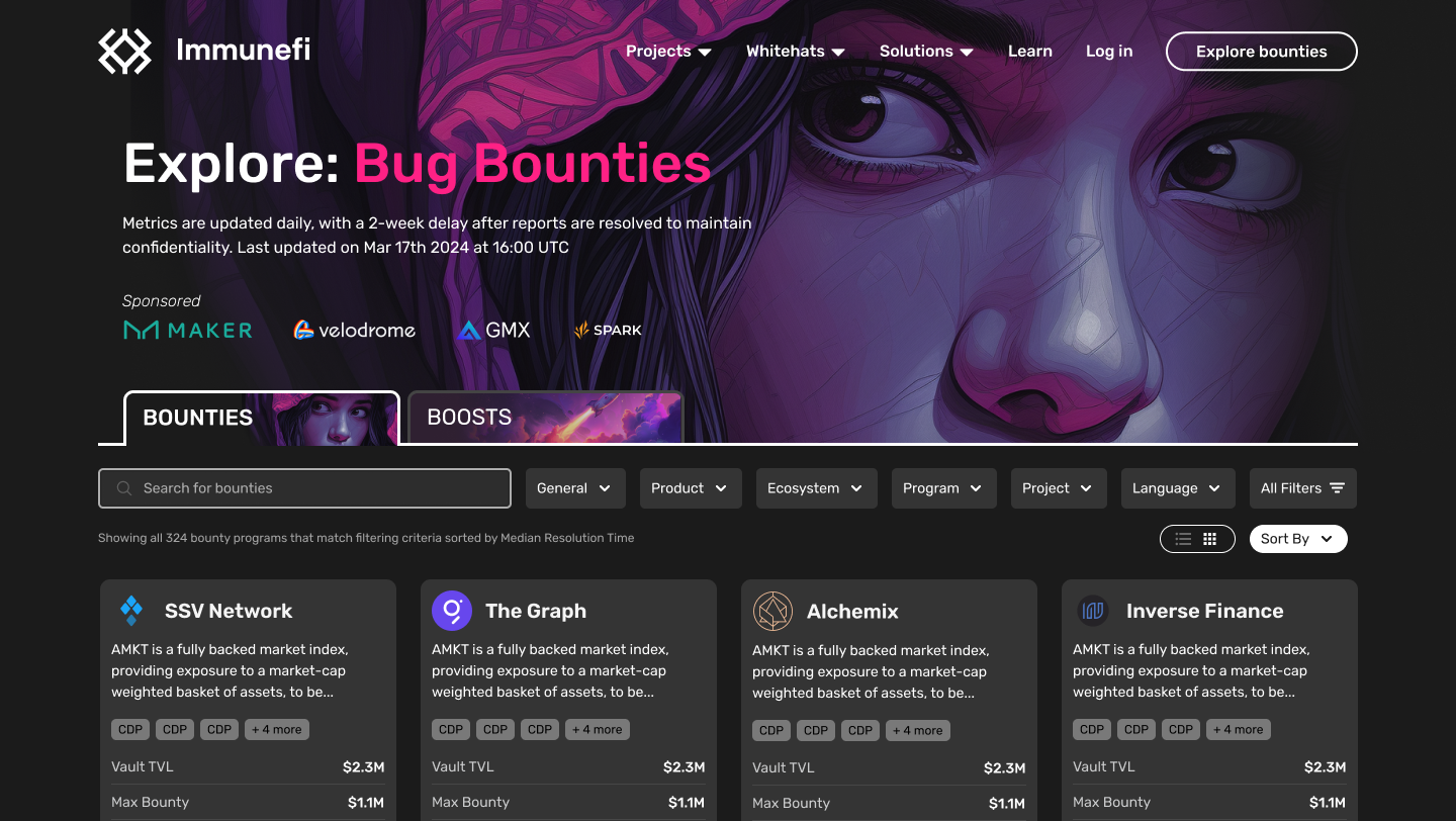
Immunefi’s early product worked, but it was built on rough Tailwind usage: generic defaults, no relationship to the brand, and no rules for anyone to follow. Every new screen was a fresh decision about things that should have been settled once.
That was fine at employee #12 scale. It stopped being fine as the team grew. Four designers and twenty engineers making independent calls about buttons, spacing, and data display doesn’t produce four times the output; it produces drift. And on a platform where people stake real money on whether the interface feels trustworthy, drift is expensive.
What I owned
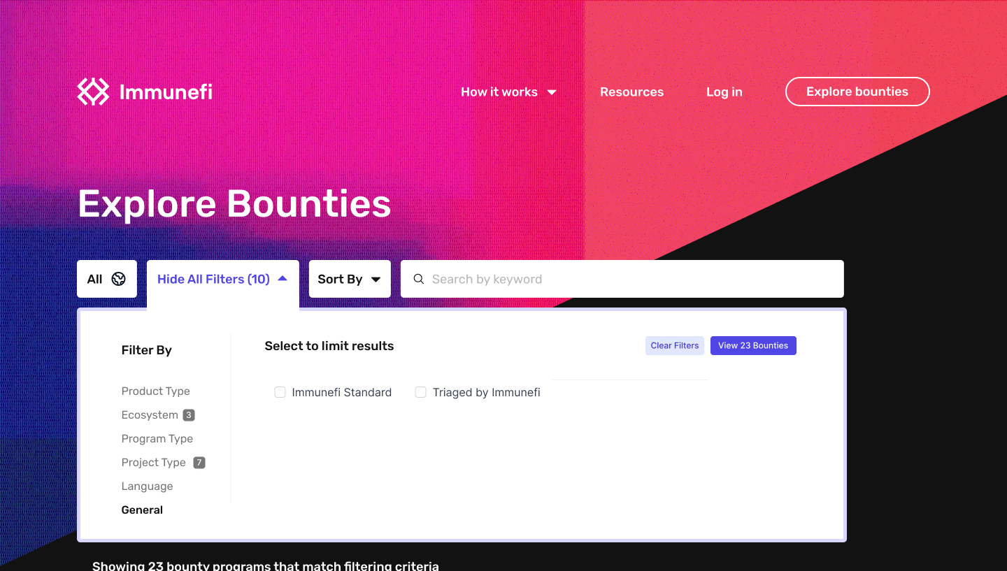
There was no design system and no one to inherit one from, so I built it the way you build anything at an early-stage company: alongside everything else, piece by piece, starting with the parts that hurt most. Over the years it became the shared language for the whole design and engineering org, spanning the researcher platform, the marketing site, and eventually a third product, the orchestration platform, that launched entirely on the system.
How I approached it
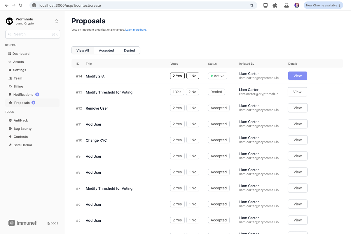
I structured the library on atomic design: atoms and molecules first, assembled upward into larger patterns. The foundations came before the flourishes: a color system tied to the brand instead of Tailwind’s palette, a type scale, spacing rules. Tokens and variables didn’t exist in Figma when I started the library, so early versions encoded the rules through styles and discipline; as the tooling matured, so did the system.
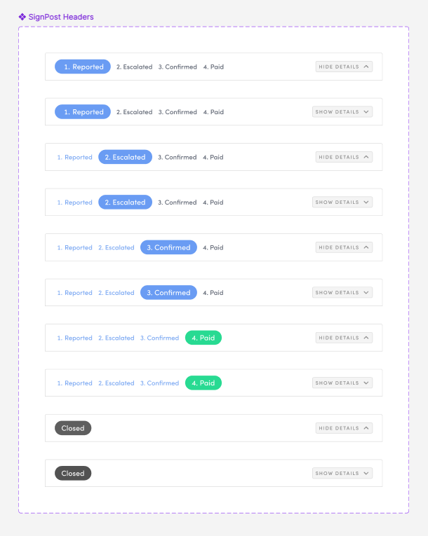
At its peak the library held a couple hundred components across those layers. But the honest lesson of maintaining it for years is that the value concentrated at the bottom of the pyramid. The atoms and molecules, the buttons, fields, cards, badges, and data rows, earned their keep every single day. The big page-level assemblies mostly didn’t; real pages diverged too much for them to keep paying rent. I stopped investing there and put the effort into making the smaller pieces bulletproof instead.
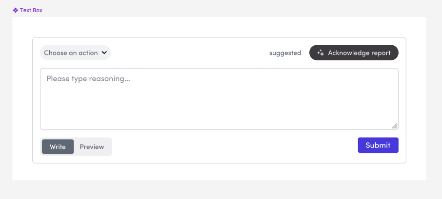
The other half of governance was review. New work got checked against the system continuously, not as a gatekeeping step at the end but as part of how design critique worked. Consistency isn’t a launch milestone; it’s a habit you either keep or lose. On the engineering side, the system was mirrored in a coded component library, so the Figma source of truth and what actually shipped stayed in step across all three products.
Outcome
The speed change was the clearest signal. Early on, features took one to three months; once the patterns were settled, comparable work shipped in days. Not because anyone worked harder, but because whole categories of decisions stopped needing to be made. That reclaimed thinking time went where it mattered: the genuinely hard, novel problems got deeper attention, faster.
Nobody was formally measuring design-system adoption. We were a startup, and the system was a means, not the mission. But roughly 80 application pages and 30 marketing pages were built on it, the orchestration platform launched on it from day one, and it’s part of how the platform scaled to 60K researchers and a $30M Series A without the interface fracturing along the way.
Looking back
A design system isn’t the components. It’s the hundreds of times someone asked “do we already have this?” and the answer was yes.
If I built it again I’d do two things differently: start the foundations earlier, before the drift had anything to grab onto, and skip the big page-level assemblies entirely, since the pyramid’s bottom is where the leverage lives. What I’d keep is the governance: unglamorous, repetitive, and the actual reason three products still looked like one company.