Designing Rubic, from competition win to $5.6B in swaps
Rubic ran an open design competition to launch their cross-chain trading platform. My submission took first place and became the product. The platform has since grown to 500K+ users swapping across 100+ blockchains, with $5.6B in accumulated transaction volume.

The problem
Cross-chain trading is genuinely hard. To move a token from one blockchain to another, a user has to pick a bridge, choose a route, and weigh gas costs on both ends — and getting any of it wrong means high fees, failed transactions, or funds stuck in transit.
Rubic aggregated all of those options into one platform, but the interface passed that technical complexity straight through to the user. People without deep DeFi expertise abandoned swaps halfway, or pushed through and made expensive mistakes. My job was to make a swap across 100+ blockchains feel like one decision, not five — without taking away the control that serious traders came to Rubic for.
What I owned
This work happened through KOI, the product design studio I started after Immunefi. The relationship began when Rubic ran an open design competition to launch their platform: my entry took first place, and the winning work became the foundation the product launched on. From there I stayed on for the deeper engagement — a full UX review, a revamp of the swap interface, and the brand direction that carried through the product and marketing.
How I approached it
I started by looking at how people actually used the product: where users dropped off mid-swap, what competitor platforms did better and worse, and what the community was complaining about. Two very different users kept showing up in that research. New DeFi users were overwhelmed by the jargon and just wanted a swap that worked. Experienced traders wanted the opposite: granular control and full transparency into routes, bridges, and gas.
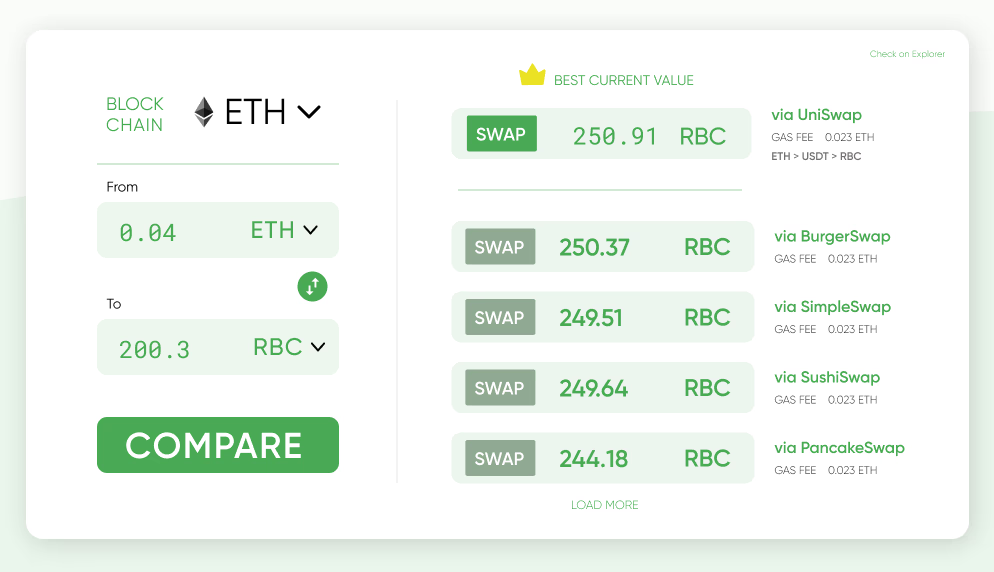
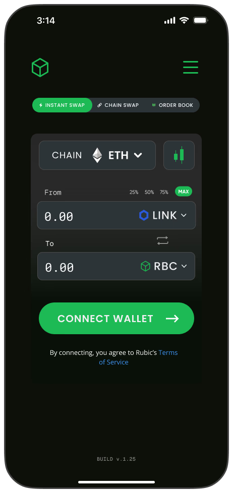
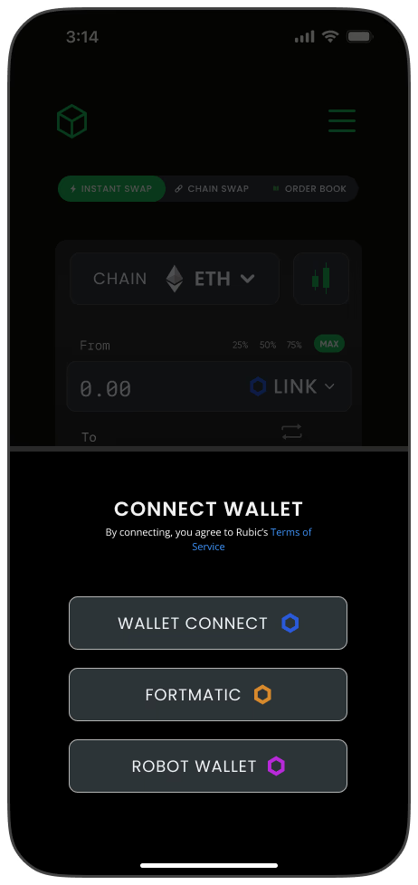
Rather than pick a side, I designed around progressive disclosure. The default experience surfaces one clearly recommended route, so a newcomer can swap without ever thinking about bridges. An advanced view sits one tap deeper, comparing alternative routes side by side — estimated time, total cost breakdown, and bridge provider — so power users can override the default with confidence instead of guesswork.
Impact
Rubic has since grown into a leading piece of cross-chain infrastructure, supporting 100+ blockchains and aggregating 330+ DEXs. As with Immunefi, I won't claim that scale as solely my own doing — but the interface those 500K+ users swap through is the one this work built.
Looking back
The best route is the one a trader never has to think about. Good defaults aren't a convenience feature — they are the product.
Rubic taught me that you don't have to choose between beginners and experts. One interface can serve both if you're disciplined about what shows up first and honest about what lives a layer deeper.